详细信息
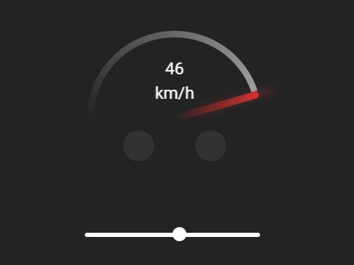
速度计样式的圆形进度表,以百分比表示当前进度。用 JavaScript (jQuery) 和 CSS/CSS3 编写。
看到它在行动:
如何使用它:
1. 为速度计和范围滑块创建 HTML。
<div class="progress">
  <div class="precent">100 km/h</div>
  <div class="circle"></div>
  <div class="range">
    <input type="range" min="0" max="100" value="47" id="range">
    <div class="filled"></div>
  </div>
</div>
2. 车速表必要的 CSS & CSS3 规则。
.progress {
  width: 200px;
  height: 200px;
  position: absolute;
  top: 50%;
  left: 50%;
  transform: translate(-50%, -50%) rotateY(180deg);
}
.progress:before {
  content: "";
  position: absolute;
  width: 185px;
  height: 185px;
  background: #232323;
  border-radius: 100%;
  top: 50%;
  left: 50%;
  transform: translate(-50%, -50%);
  z-index: 99;
}
.progress:after {
  content: "";
  position: absolute;
  width: 8px;
  height: 100px;
  background: linear-gradient(180deg, #d63031, #232323);
  border-radius: 10px;
  box-shadow: 0 -19px 9px -3px #d63031;
  top: 0;
  right: 50%;
  margin-right: -4px;
  z-index: 999;
  transform: rotate(90deg);
  transform-origin: bottom;
  animation-name: meter;
  animation-duration: 5s;
  animation-iteration-count: infinite;
  animation-timing-function: cubic-bezier(0, 0.1, 0.9, 0.81);
  animation-play-state: paused;
  animation-direction: reverse;
  animation-delay: 5s;
}
.progress .precent {
  position: absolute;
  top: 29px;
  left: 50%;
  z-index: 99;
  transform: translate(-50%, 0) rotateY(180deg);
  font-size: 19px;
  color: white;
  width: 47px;
  text-align: center;
  line-height: 1.5;
}
.progress .precent:after {
  content: "";
  position: absolute;
  width: 35px;
  height: 35px;
  background: #323232;
  border-radius: 100%;
  top: 85px;
  right: -35px;
}
.progress .precent:before {
  content: "";
  position: absolute;
  width: 35px;
  height: 35px;
  background: #323232;
  border-radius: 100%;
  top: 85px;
  left: -35px;
}
.progress .circle {
  width: 200px;
  height: 200px;
  background: white;
  background: conic-gradient(
    from 91deg,
    #d63031 0%,
    #ffffff 20%,
    transparent 100%
  );
  -webkit-clip-path: polygon(
    0% 100%,
    0% 0%,
    100% 0%,
    100% 50%,
    50% 50%,
    100% 50%,
    100% 100%
  );
  clip-path: polygon(
    0% 100%,
    0% 0%,
    100% 0%,
    100% 50%,
    50% 50%,
    100% 50%,
    100% 100%
  );
  animation-name: loading;
  animation-duration: 5s;
  animation-iteration-count: infinite;
  animation-timing-function: cubic-bezier(0, 0.1, 0.9, 0.81);
  animation-play-state: paused;
  animation-direction: reverse;
  animation-delay: 5s;
  border-radius: 100%;
}
@keyframes loading {
  0% {
    -webkit-clip-path: polygon(
      0% 100%,
      0% 0%,
      100% 0%,
      100% 50%,
      50% 50%,
      100% 50%,
      100% 100%
    );
    clip-path: polygon(
      0% 100%,
      0% 0%,
      100% 0%,
      100% 50%,
      50% 50%,
      100% 50%,
      100% 100%
    );
  }
  12.5% {
    -webkit-clip-path: polygon(
      0% 100%,
      0% 0%,
      100% 0%,
      100% 50%,
      50% 50%,
      100% 100%,
      100% 100%
    );
    clip-path: polygon(
      0% 100%,
      0% 0%,
      100% 0%,
      100% 50%,
      50% 50%,
      100% 100%,
      100% 100%
    );
  }
  25% {
    -webkit-clip-path: polygon(
      0% 100%,
      0% 0%,
      100% 0%,
      100% 50%,
      50% 50%,
      50% 100%,
      50% 100%
    );
    clip-path: polygon(
      0% 100%,
      0% 0%,
      100% 0%,
      100% 50%,
      50% 50%,
      50% 100%,
      50% 100%
    );
  }
  37.5% {
    -webkit-clip-path: polygon(
      0% 100%,
      0% 0%,
      100% 0%,
      100% 50%,
      50% 50%,
      0% 100%,
      0% 100%
    );
    clip-path: polygon(
      0% 100%,
      0% 0%,
      100% 0%,
      100% 50%,
      50% 50%,
      0% 100%,
      0% 100%
    );
  }
  50% {
    -webkit-clip-path: polygon(
      0% 50%,
      0% 0%,
      100% 0%,
      100% 50%,
      50% 50%,
      0% 50%,
      0% 50%
    );
    clip-path: polygon(
      0% 50%,
      0% 0%,
      100% 0%,
      100% 50%,
      50% 50%,
      0% 50%,
      0% 50%
    );
  }
  62.5% {
    -webkit-clip-path: polygon(
      0% 0%,
      0% 0%,
      100% 0%,
      100% 50%,
      50% 50%,
      0% 0%,
      0% 0%
    );
    clip-path: polygon(0% 0%, 0% 0%, 100% 0%, 100% 50%, 50% 50%, 0% 0%, 0% 0%);
  }
  75% {
    -webkit-clip-path: polygon(
      50% 0%,
      50% 0%,
      100% 0%,
      100% 50%,
      50% 50%,
      50% 0%,
      50% 0%
    );
    clip-path: polygon(
      50% 0%,
      50% 0%,
      100% 0%,
      100% 50%,
      50% 50%,
      50% 0%,
      50% 0%
    );
  }
  87.5% {
    -webkit-clip-path: polygon(
      100% 0%,
      100% 0%,
      100% 0%,
      100% 50%,
      50% 50%,
      100% 0%,
      100% 0%
    );
    clip-path: polygon(
      100% 0%,
      100% 0%,
      100% 0%,
      100% 50%,
      50% 50%,
      100% 0%,
      100% 0%
    );
  }
  100% {
    -webkit-clip-path: polygon(
      100% 50%,
      100% 50%,
      100% 50%,
      100% 50%,
      50% 50%,
      100% 50%,
      100% 50%
    );
    clip-path: polygon(
      100% 50%,
      100% 50%,
      100% 50%,
      100% 50%,
      50% 50%,
      100% 50%,
      100% 50%
    );
  }
}
@keyframes meter {
  0% {
    transform: rotate(90deg);
  }
  25% {
    transform: rotate(179deg);
  }
  50% {
    transform: rotate(269deg);
  }
  75% {
    transform: rotate(360deg);
  }
  100% {
    transform: rotate(450deg);
  }
}
3. 将自定义样式应用于常规范围滑块。
.progress .range {
  margin-top: 20px;
}

.progress input[type="range"] {
  -webkit-appearance: none;
  width: 100%;
  background: transparent;
}

.progress input[type="range"]::-webkit-slider-thumb {
  -webkit-appearance: none;
}

.progress input[type="range"]:focus {
  outline: none;
}

.progress input[type="range"]::-webkit-slider-thumb {
  -webkit-appearance: none;
  height: 16px;
  width: 16px;
  border-radius: 100%;
  background: white;
  cursor: pointer;
  margin-top: -6px;
  z-index: 9;
  position: relative;
}

.progress input[type="range"]::-moz-range-thumb {
  height: 16px;
  width: 16px;
  border-radius: 100%;
  background: white;
  cursor: pointer;
  border: 0;
  z-index: 9;
  position: relative;
}

.progress input[type="range"]::-webkit-slider-runnable-track {
  width: 100%;
  height: 5px;
  cursor: pointer;
  background: white;
  border-radius: 20px;
}

.progress input[type="range"]::-moz-range-track {
  width: 100%;
  height: 5px;
  cursor: pointer;
  background: white;
  border-radius: 20px;
}
4. 在文档末尾加载必要的 jQuery 库。
<script src="/path/to/cdn/jquery.min.js"></script>5. JavaScript(jQuery 脚本)在范围值变化时为速度计设置动画。
$(function () {
  var range = $("#range")[0];
  var percent = ((range.value - range.min) / (range.max - range.min)) * 5;
  var percentshow = Math.round(
    ((range.value - range.min) / (range.max - range.min)) * 100
  );
  if (percent < 5) {
    $(".progress .circle").attr("style", "animation-delay:-" + percent + "s");
    $("body").append(
      "<div id='meterstyle'><style>.progress:after{animation-delay:-" +
        percent +
        "s;}</style></div>"
    );
  } else {
    $(".progress .circle").attr("style", "animation-delay:5s");
    $("body").append(
      "<div id='meterstyle'><style>.progress:after{animation-delay:5s;}</style></div>"
    );
  }
  $(".progress .precent").text(percentshow + " km/h");
  $(document).on("input", "#range", function () {
    var percent = ((this.value - this.min) / (this.max - this.min)) * 5;
    var percentshow = Math.round(
      ((this.value - this.min) / (this.max - this.min)) * 100
    );
    $("#meterstyle").remove();
    if (percent < 5) {
      $(".progress .circle").attr("style", "animation-delay:-" + percent + "s");
      $("body").append(
        "<div id='meterstyle'><style>.progress:after{animation-delay:-" +
          percent +
          "s;}</style></div>"
      );
    } else {
      $(".progress .circle").attr("style", "animation-delay:5s");
      $("body").append(
        "<div id='meterstyle'><style>.progress:after{animation-delay:5s;}</style></div>"
      );
    }
    $(".progress .precent").text(percentshow + " km/h");
  });
});


发表评论
◎欢迎参与讨论,请在这里发表您的看法、交流您的观点。