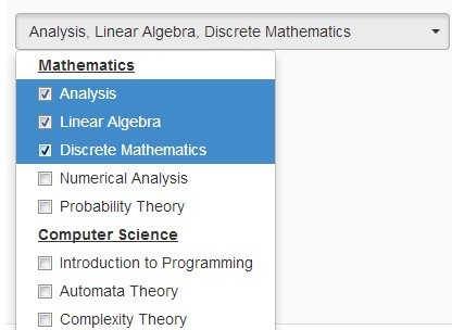
Bootstrap Multiselect 是Bootstrap 4和 3的 jQuery 插件,允许访问者从包含单个选项作为复选框的下拉选择列表中选择多个选项。
根据 Apache 许可,版本 2.0 和 BSD 3-Clause 获得许可。该引导程序3版本可以在这里找到。
更多功能:
允许选项中的 HTML 内容。
右侧或顶部下拉菜单。
全选选项单击即可选择所有选项。
可折叠的 OptGroup。
允许过滤选项。
自定义模板。
键盘可访问。
服务器端处理。
以及更多。
替代插件:
jQuery 多选框插件
jQuery 多选元素替换插件 - selectlist
用于选择多个元素的 jQuery 插件 - 多选
在以下位置查看更多 Multi Select 插件:
30 Best Multiple Select jQuery Plugins
Basic Usage:
1. Include jQuery javascript library and Twitter's Bootstrap framework on your page.
<link rel="stylesheet" href="/path/to/cdn/bootstrap.min.css" />
<script src="/path/to/cdn/jquery.min.js"></script>
<script src="/path/to/cdn/bootstrap.min.js"></script>
2. Include jQuery bootstrap multiselect plugin on the page, after jQuery library.
<link rel="stylesheet" href="css/bootstrap-multiselect.css" type="text/css">
<script type="text/javascript" src="js/bootstrap-multiselect.js"></script>
3. Create a standard select list.
<select id="demo" multiple="multiple">
  <option value="Javascript">Javascript</option>
  <option value="Python">Python</option>
  <option value="LISP">LISP</option>
  <option value="C++">C++</option>
  <option value="jQuery">jQuery</option>
  <option value="Ruby">Ruby</option>
</select>
4. Call the function on the select element to initialize the plugin.
$(function(){
  $('#demo').multiselect();
});
5. 自定义多选的所有默认插件选项。
$('#demo').multiselect({

  // allows HTML content
  enableHTML: false,

  // CSS class of the multiselect button
  buttonClass: 'custom-select',

  // inherits the class of the button from the original select
  inheritClass: false,

  // width of the multiselect button
  buttonWidth: 'auto',

  // container that holds both the button as well as the dropdown
  buttonContainer: '<div class="btn-group" />',

  // places the dropdown on the right side
  dropRight: false,

  // places the dropdown on the top
  dropUp: false,

  // CSS class of the selected option
  selectedClass: 'active',

  // maximum height of the dropdown menu
  // if maximum height is exceeded a scrollbar will be displayed
  maxHeight: false,

  // includes Select All Option
  includeSelectAllOption: false,

  // shows the Select All Option if options are more than ...
  includeSelectAllIfMoreThan: 0,

  // Lable of Select All
  selectAllText: ' Select all',

  // the select all option is added as additional option within the select
  // o distinguish this option from the original options the value used for the select all option can be configured using the selectAllValue option.
  selectAllValue: 'multiselect-all',

  // control the name given to the select all option
  selectAllName: false,

  // if true, the number of selected options will be shown in parantheses when all options are seleted.
  selectAllNumber: true,

  // setting both includeSelectAllOption and enableFiltering to true, the select all option does always select only the visible option
  // with setting selectAllJustVisible to false this behavior is changed such that always all options (irrespective of whether they are visible) are selected
  selectAllJustVisible: true,

  // enables filtering
  enableFiltering: false,

  // determines if is case sensitive when filtering
  enableCaseInsensitiveFiltering: false,

  // enables full value filtering
  enableFullValueFiltering: false,

  // if true, optgroup's will be clickable, allowing to easily select multiple options belonging to the same group
  enableClickableOptGroups: false,

  // enables collapsible OptGroups
  enableCollapsibleOptGroups: false,

  // collapses all OptGroups on init
  collapseOptGroupsByDefault: false,

  // placeholder of filter filed
  filterPlaceholder: 'Search',

  // possible options: 'text', 'value', 'both'
  filterBehavior: 'text',

  // includes clear button inside the filter filed
  includeFilterClearBtn: true,

  // prevents input change event
  preventInputChangeEvent: false,

  // message to display when no option is selected
  nonSelectedText: 'None selected',

  // message to display if more than numberDisplayed options are selected
  nSelectedText: 'selected',

  // message to display if all options are selected
  allSelectedText: 'All selected',

  // determines if too many options would be displayed
  numberDisplayed: 3,

  // disables the multiselect if empty
  disableIfEmpty: false,

  // message to display if the multiselect is disabled
  disabledText: '',

  // the separator for the list of selected items for mouse-over
  delimiterText: ', ',

  // includes Reset Option
  includeResetOption: false,

  // includes Rest Divider
  includeResetDivider: false,

  // lable of Reset  Option
  resetText: 'Reset',

  // indent group options
  indentGroupOptions: true,

  // possible options: 'never', 'always', 'ifPopupIsSmaller', 'ifPopupIsWider'
  widthSynchronizationMode: 'never',

  // text alignment
  buttonTextAlignment: 'center',

  // custom templates
  templates: {
    button: '<button type="button" class="multiselect dropdown-toggle" data-toggle="dropdown"><span class="multiselect-selected-text"></span></button>',
    <a href="https://www.jqueryscript.net/tags.php?/popup/">popup</a>Container: '<div class="multiselect-container dropdown-menu"></div>',
    filter: '<div class="multiselect-filter"><div class="input-group input-group-sm p-1"><div class="input-group-prepend"><i class="input-group-text fas fa-search"></i></div><input class="form-control multiselect-search" type="text" /></div></div>',
    filterClearBtn: '<div class="input-group-append"><button class="multiselect-clear-filter input-group-text" type="button"><i class="fas fa-times"></i></button></div>',
    option: '<button class="multiselect-option dropdown-item"></button>',
    divider: '<div class="dropdown-divider"></div>',
    optionGroup: '<button class="multiselect-group dropdown-item"></button>',
    resetButton: '<div class="multiselect-reset text-center p-2"><button class="btn btn-sm btn-block btn-outline-secondary"></button></div>'
  }

});
6. 回调函数。
/**
 * Default text function will either print 'None selected' in case no
 * option is selected or a list of the selected options up to a length
 * of 3 selected options.
 *
 * @param {jQuery} options
 * @param {jQuery} select
 * @returns {String}
 */
buttonText: function (options, select) {
    if (this.disabledText.length > 0
        && (select.prop('disabled') || (options.length == 0 && this.disableIfEmpty))) {

        return this.disabledText;
    }
    else if (options.length === 0) {
        return this.nonSelectedText;
    }
    else if (this.allSelectedText
        && options.length === $('option', $(select)).length
        && $('option', $(select)).length !== 1
        && this.multiple) {

        if (this.selectAllNumber) {
            return this.allSelectedText + ' (' + options.length + ')';
        }
        else {
            return this.allSelectedText;
        }
    }
    else if (this.numberDisplayed != 0 && options.length > this.numberDisplayed) {
        return options.length + ' ' + this.nSelectedText;
    }
    else {
        var selected = '';
        var delimiter = this.delimiterText;

        options.each(function () {
            var label = ($(this).attr('label') !== undefined) ? $(this).attr('label') : $(this).text();
            selected += label + delimiter;
        });

        return selected.substr(0, selected.length - this.delimiterText.length);
    }
},
/**
 * Up<a href="https://www.jqueryscript.net/time-clock/">date</a>s the title of the button similar to the buttonText function.
 *
 * @param {jQuery} options
 * @param {jQuery} select
 * @returns {@exp;selected@call;substr}
 */
buttonTitle: function (options, select) {
    if (options.length === 0) {
        return this.nonSelectedText;
    }
    else {
        var selected = '';
        var delimiter = this.delimiterText;

        options.each(function () {
            var label = ($(this).attr('label') !== undefined) ? $(this).attr('label') : $(this).text();
            selected += label + delimiter;
        });
        return selected.substr(0, selected.length - this.delimiterText.length);
    }
},
checkboxName: function (option) {
    return false; // no checkbox name
},
/**
 * Create a label.
 *
 * @param {jQuery} element
 * @returns {String}
 */
optionLabel: function (element) {
    return $(element).attr('label') || $(element).text();
},
/**
 * Create a class.
 *
 * @param {jQuery} element
 * @returns {String}
 */
optionClass: function (element) {
    return $(element).attr('class') || '';
},
/**
 * Triggered on change of the multiselect.
 *
 * Not triggered when selecting/deselecting options manually.
 *
 * @param {jQuery} option
 * @param {Boolean} checked
 */
onChange: function (option, checked) {

},
/**
 * Triggered when the dropdown is shown.
 *
 * @param {jQuery} event
 */
onDropdownShow: function (event) {

},
/**
 * Triggered when the dropdown is hidden.
 *
 * @param {jQuery} event
 */
onDropdownHide: function (event) {

},
/**
 * Triggered after the dropdown is shown.
 *
 * @param {jQuery} event
 */
onDropdownShown: function (event) {

},
/**
 * Triggered after the dropdown is hidden.
 *
 * @param {jQuery} event
 */
onDropdownHidden: function (event) {

},
/**
 * Triggered on select all.
 */
onSelectAll: function () {

},
/**
 * Triggered on deselect all.
 */
onDeselectAll: function () {

},
/**
 * Triggered after initializing.
 *
 * @param {jQuery} $select
 * @param {jQuery} $container
 */
onInitialized: function ($select, $container) {

},
/**
 * Triggered on filtering.
 *
 * @param {jQuery} $filter
 */
onFiltering: function ($filter) {

},
7. API methods.
// destroy the instance
$('#demo').multiselect('destroy');

// refresh the checked checkboxes based on the currently selected options
$('#demo').multiselect('refresh');

// rebuild the instance
$('#demo').multiselect('rebuild');

// select an option
$('#demo').multiselect('select', value);

// deselect an option
$('#demo').multiselect('deselect', value);

// select all options
$('#demo').multiselect('selectAll', justVisible);

// deselect all options
$('#demo').multiselect('deselectAll', justVisible);

// update the text and title of the button
$('#demo').multiselect('updateButtonText');

// update options
$('#demo').multiselect('setOptions', options);

// enable/disable the multiselect
$('#demo').multiselect('disable');
$('#demo').multiselect('enable');

/* provide options programmatically
  var data = [
      {label: 'Option 1', title: 'Option 1', value: '1', selected: true},
      {label: 'Option 2', title: 'Option 2', value: '2'},
      {label: 'Option 3', title: 'Option 3', value: '3', selected: true}
  ];
*/
$('#demo').multiselect('dataprovider', data);

// programmatically provide a new text to display in the button when all options are selected, at runtime
$('#demo').multiselect('setAllSelectedText', value);
Changelog:
v1.1.1 (2021-08-07)
Reset button option
onSelectAll and onDeselectAll get changed options as argument
Fixed Keyboard support
Fixed Bower and NPM specs, specifically regarding Bootstrap version and meta information
v1.1.0 (2021-07-30)
Redesign of filter and active items
Added new option "widthSynchronizationMode"
Added new option "buttonTextAlignment"
Fixed bugs
2020-12-22
Fix select width
v1.0.0 (2020-11-18)
Updated for Bootstrap 4.
2020-11-01
v0.9.16
2018-03-04
v0.9.15
2018-01-03
bugfix
2017-12-18
bugfix
2016-08-18
v0.9.13
2016-07-30
Fixed: deselect/select doesn't work with search when value is typed in search
2016-07-29
Adding data-placeholder collapses multiselect
2016-07-23
Fixed More issues with enableCollapsibleOptGroups
2016-04-23
Allows different checkbox name for the same dropdown
2016-04-21
fixed select all + clickable + collapsible issues.
2016-04-20
bugfix
2016-04-18
Some fixes and more tests for clickable and collapisble option groups.
v0.9.13 (2015-10-15)
bugfix
2015-05-27
Added option to collapse groups (some kind of sub menu)
onChange is triggered for each (de)selected option separately.
2015-04-12
fixed bugs.
2015-03-18
v0.9.12
2015-03-01
update.
2015-02-17
update.
2015-02-14
Add onSelectAll option
2015-02-13
Support filter with clickable opt groups.
2014-11-02
fixed an issue.
2014-10-13
fixed an issue.
2014-08-08
fix for IE 8.
2014-08-03
Improve filter performance.
Add onDropdownShown function call back.
2014-07-15
Update
2014-05-24
Update
2014-04-02
Updated enable, disable demo.
2014-04-01
templates can be overriden using configuration options.
2014-03-31
update.
2014-03-13
Bootstrap 3.1.1 update.
Fixed bugs.
2014-03-12
Bootstrap 3.1.1 update.
Fixed bugs.
2014-02-07
fixes.
2014-01-09
Fixed bug When all options started as selected='selected', select all checkbox does not checked
2013-12-10
Fixed bug when no options binding is given


发表评论
◎欢迎参与讨论,请在这里发表您的看法、交流您的观点。